Color Schemes: Designing Ideas for Using Color Palettes
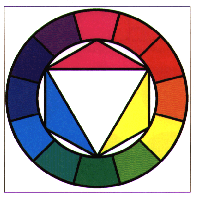
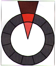
Subtractive Color Wheel
This color wheel has been adjusted so that it uses the proper subtractive
primaries of cyan, magenta, and yellow. The blue and violet ranges of
the corrected color wheel are prominent, but yellow and orange are far
less prominent.
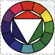
Additive Color Wheel
There are few color wheels today that demonstrate the principles of additive color mixing. This is unfortunate bccause the expanding boundaries of digital and electronic media make using such a wheel more important than ever.The additive color wheel has a superficial resemblance to the subtractive color wheel, but the balance of colors is radically different. The nature of the primaries of light tends to favor a heavy distribution of blues and greens, whereas yellow and red make only a slight impact on the color wheel. This same sort of distribution can be observed in the spectrum, which is dominated by the blue wavelengths of light whereas short shrift is given to the red wavelengths.
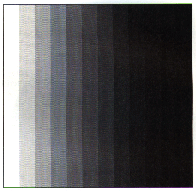
Neutral Colors: Greyscale
One large group of colors omitted by the color wheel is the neutral colors which are colors not influenced by any color in any way - in other words, grays. Although there are an infinite number of grays between black and white, the eye perceives a 256-step grayscale as a seamless gradation between white and black. A simple twelve-step grayscale is presented above
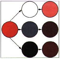
Tints, Shades, and Tones
Even when you add neutral colors to the Pure chromatic hues of the color wheel, there are a disconcerting number of colors that remain unaccounted for in the color wheel. From experience You know that there is more than one color of red - there are dark reds and there are light reds, there are dull reds and there are intense reds. These colors are the result of the pure hues mixed with varying amounts of black, white, and gray as demonstrated above.
-
When you mix a pure hue with white, the result is called a tint of the hue. Pink, for example, is a tint of red much like lavender is a tint of violet. Subtle tints of a hue tend to be barely noticeable, whereas more overt tints tend to look like pastel colors.
-
When you mix a pure hue with black, the result is called a shade of the hue. The hue Indigo, for example, is a shade of blue, whereas maroon is a shade of magenta. Subtle shades of a hue tend to be less emphatic whereas more overt shades are almost indistinguishable from black.
-
When a pure hue is mixed with a gray, the result is called a tone of the hue. Goldenrod, for example, is a tone of yellow, whereas mauve is a tone of Purple. Bright tones such as blue-gray tend to be quite sedate whereas dull tones like olive tend to be quite drab.
Tints shades, and tones can be extremely useful aspects of any color scheme. They enable a single color to express a much wider range of feeling and thus add variety to otherwise dull compositions. Tones of red, orange, and yellow are generally referred to as either brown or beige. Although some sources refer to brown as a neutral color, they are wrong. Although much of the character of the basic hue is eliminated in the mixing of brown, enough color remains that some of its fundamental character shines through.
Monochromatic Color Scheme
The simplest of all color schemes is the monochromatic color scheme As the name suggests monochromatic color schemes use a single pure hue. Using a number of tints and shades of' the hue provides the variety. Thus, a monochromatic color scheme based on red may include pure red, brick red (a shade of red). strawberry (a mild tint of-red), and pink (an extreme tint of red). Monochromatic color schemes tend to be extremely unified and harmonious, and are also effective for establishing an overall mood - provided you can establish the mood with only a single color. At times monochromatic color schemes can be dull because of the lack of variation and therefore can lose the interest of viewers.
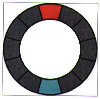
Complementary
Colors directly opposite from each other on the color wheel are referred to as complementary colors. If you took geometry in high school, then you probably remember the concept of complementary angles: two angles that, when combined, form a right angle. The principle behind complementary colors is similar. When you mix two complementary colors together they produce white (if additive), or black (if subtractive). This is because colors directly opposite from each other have inverse proportions of the three primary colors. (The complement of additive red, for example, is cyan, which is a mixture of full-strength blue and green). The primary advantage of complementary color schemes is that they are extremely eye-catching and vibrant in many cases, even more eye-catching than color schemes that use the primary triad. This also ensures that complementary color schemes are seldom dull. The extremely limited number of colors in complementary schemes, however, means that they are easily digested and then discarded by the viewer.
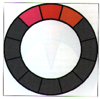
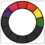
Analogous
Another simple color scheme is the analogous color scheme, which uses two or three colors next to each other on the color wheel (red, red-violet, and magenta, for example). The sheer number of possible combinations makes the analogous color scheme a versatile one. Although it is possible to expand an analogous color scheme to include four or even five adjacent colors, by that time the range of colors is so large that the colors at the extreme ends of the spectrum have very little to do with each other, which tends to dilute the overall effect of an analogous color scheme. Although analogous color schemes are extremely versatile, the similarity of the colors tends to make them harmonious as well. Unfortunately, this lack of overt contrast often means that poorly developed analogous color schemes often fail to grab the viewer's attention and don't stand out in a crowd.
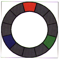
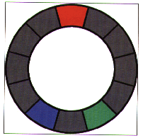
Triadic
A triadic color scheme uses three different colors evenly spaced around the color wheel. One of the most effective is to use the three primary colors, red, green, and blue. Other triads are possible, but have less impact visually.
These schemes introduce stability because each leg of the triad balances the other two. There is also a simple relationship between the colors which can lend itself to very dynamic looks. This simplicity can also be garish if not well done.
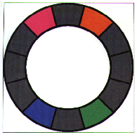
Split Complementary
A variation on the complementary color scheme is the split complementary color scheme, wherein one of the complements is broken into tile two colors that are adjacent to it. A red-cyan complementary color scheme, for example could be turned into a composition that uses red, light blue, and sea green. The advantage of the split complementary color scheme is that it has more variety than a simple complementary color scheme. This variety, however, also makes split complementary color schemes less vibrant and eye-catching. To make matters worse, it is often hard to harmonize the colors in a split complementary color scheme.
Double Split Complementary
As the name implies, tile double Split complementary color scheme is yet another variation of the complementary color scheme Instead of merely Splitting up one of the complements into the two colors next to it, both complements are split. The big advantage of the double split complementary color scheme is that it is even more varied than the split complementary color scheme. This is also a downfall because it is even less vibrant than the split complementary scheme and is even harder to harmonize.
Warm
The hues of magenta, red, orange, yellow, and yellow-green are generally referred to as the warm colors. These colors produce a synaesthetic experience of heat in most viewers. Studies have been conducted in which test subjects were placed in rooms painted in a warm color and their perceptions of the room's temperature was almost always much warmer than its actual temperature. The warmth that these colors radiate tends to make them seem warm, cozy, and inviting and they draw attention very easily. Psychologically warm colors are associated with happiness arid comfort. Completely warm color schemes have the advantage of being pleasantly inviting and inherently harmonious. Warm color schemes with no variety, however, have the disadvantage of being tremendously dull with no Inherent eye-catching color
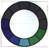
Cool
The hues Of Violet, blue, light blue, cyan, and sea green are generally referred to as the Cool colors. As with the warm colors, the cool colors can shift your perception of temperature although they tend to make you feel colder instead of warmer. Compositions that use the Cool colors often seem slick and professional, but the coldness these colors radiate often turns people off. Psychologically, cool colors are associated with sadness, depression, and melancholia. Completely cool color schemes have the advantage of being extremely harmonious and professional looking. Just as with warm color schemes, however, cold color schemes with no variety are often dull.
Note: There are two colors not classified as warm or cool: purple and pure green. These two colors don't fit easily into the cold/ warm classification. They seem to take on properties of warmth or coolness based on the context in which they've been placed. Use these two colors with great care in your warm and cool compositions.